Wednesday 4 December 2013

HNC Project Five - Landscape, Properties and Product

It has been a very difficult time (the last couple of months), and weaving work has taken a back seat, along with a lot of other things.

Weaving has been hard, challenging and utterly frustrating, perhaps I was over ambitious.  Using monofilament was not a good idea - though I am sure if all my stars were aligned, it would be easier :)

Most of the mono has been ditched, but I have retained some elements and am making some samples which I can live with - hooray !

 Little fish


One way - not entirely successful - to create a second beam.  At last, I have been able to put peg loom to some use.

I also discovered that super glue can be your friend when using monfilament, and that it is possible to come up with a knot which will work :)


Double weave sample which I was really pleased with, however, the technical problems (warp) meant I had reconsider my position.


I decided to discard the warp, and start agin !
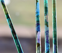


Over to the right -->
perspex rods, dyed with alcohol inks
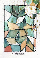


One of the earlier
images from my sketchbook


Monday 14 October 2013

Kendal Wool Gathering

Weaving Friends Sales Table
This was the very first Kendal wool gathering (Sat and Sun).  I went along today to support The Weaving Friends of Farfield Mill.  Weaving Friends were demonstrating weaving on table looms and and a small tapestry loom.  I was spinning.  Got the chance to have a look around the stalls, quite varied, some I hadn't seen before.  I suspect that's because some of these were smaller suppliers/makers not able to justify the cost of a stall at Woolfest or similar.


One of the Whynot Alpacas


I had a tip off from my other half that a long standing (but rarely met) had "got into Alpacas" - and was surprised to meet up with Isobel and Peter today.  Lovely Alpacas and lovely alpaca goods for sale.  Alpacas have such pretty faces, don't you think?

I also bumped into a former work colleague and his very inquisitive daughter :)

Such a nice day.  Took a few pictures, but the lighting in the hall was pretty bad (and it was a wee bit drafty)

And finally, Porn for Spinners.......................

Sunday 22 September 2013

Yarn Counts


Peggy Osterkamp's Blog has a useful yarn count table

Useful link to yarn count table

Peggy Osterkamp's Weaving Blog

Peggy Osterkamp's Weaving Blog

Wooly Directory


A very useful directory found in the Journal for Spinners Weavers and Dyers - view or download

"A Celebration of Wool - the Full Fleece"

Friday 13 September 2013

HNC Project Three - Manipulation and Distortion

 Limestone


Early summer  2013 at Arnside, Cumbria
"Arnside is a village and civil parish in Cumbria, England. It faces the estuary of the River Kent on the north eastern corner of Morecambe Bay, within the Arnside and Silverdale Area of Outstanding Natural Beauty." (wikipaedia)
My first real visit and so shocked and disappointed to find the beach was in fact, a mud flat :(  Who knew?

It was a grey day, low light and not very inspiring, however, on scratching the surface.....................


Mood board for this project: exploring cracked and weathered limestone rock, lichen, reflections.


A graphite study of strata and 
cracks in a layer of limestone 
on the edge of the beach. 

Finding key shapes in the rock


A first response, in colour, to the inhabited cracks in the limestone.


Felted textile

I incorporated scraps of fabric and 
copper wire, hand-made threads 
(watch out Michael Brennand-Wood!)
.....must look for a better image, or take a new one.

Incidentally, Michael Brennand-Wood - I find his work very stimulating.  I was quite moved by a piece I found through an internet search, I must go and see it at the Bankield Museum, Halifax (2000) 

I seem to have mislaid every photo I took for project 3.  Oh dear.


Monday 21 January 2013

HNC Project Two - Hand-crafted Textiles

Charles Rennie Mackintosh, Architect

I knew Charles Rennie Mackintosh (CRM) was an architect.  I was right about that, but there was so much more to find out.  I have only skimmed the surface I think, but nonetheless, have enough visual material and brain fodder to begin to formulate some design structures for weaving.  Setting aside the design of buildings, there are some lovely examples of Mackintosh watercolours, textile designs and interiors. 

This time around I have done quite a bit of primary research.  I visited the Kelvingrove Museum, took tours around the Glasgow School of Art and the Mackintosh House at the Hunterian Museum and even had a coffee at the Sauchiehall Street Tea Rooms (no tea for me, thanks all the same)

From the outset, I was drawn to the watercolour paintings of flowers, not least because of the beautiful natural colour palette, rich yet muted tones of red through blue.  Yes, he used other colours, but those within the red/purple/blue sector move me in

some way.  They are the colours which he and Margaret Mackintosh used extensively in their Gesso panels for interiors, and the colours they sparingly scattered in the otherwise starkly black and white interiors.

In my sketchbook (left) I have brought together two images of Mackintosh's work, at the top left, a watercolour of anemone and pasque, and below it, the double doors leading to the Salon Deluxe (Dining Room) at the Willow Tea Room in Sauchiehall Street in Glasgow.

What I found remarkable was the similarity of colours used in both images, though each in a completely different medium and setting, and years apart in realisation.  The watercolour is dated 1915 and the tearoom interior was designed in 1904


When I visited the Willow Street Tea Rooms I was disappointed to find the doors pinned open, and each one encased in  protective perspex box.   I was disappointed. However, I do understand the need for conservation.

In my sketchbook, I grabbed the key colours from the anemone painting, and explored the leaded glass doors,seeking out shapes and relationships between the leaded bands and the glass panels contained within them, to create the doodles on the right. 

These colours are quite strong and I worked hard to pull out tones and shades from the basic colour palette - just as CRM has done in the watercolour.  I lack a bit of skill in the painting department, but having said that, I achieved what I set out to do, which was to extract the tints tones and shades from the watercolour and transfer them to the linear shapes in my doodles.  The blue/purple was the hardest colour to control, I think It's ok, perhaps a little nearer to blue than purple.  

I became quite mesmerised by these doodles, they proved quite addictive (I did some more of these). I have loved working with the strong black line, and throwing a few curves into the doodles. 


My own photographs of the doors are interesting and appear "arty", not by design, but because the doors were encased and I was unable to get the direct "up front" shot I wanted.  And, I only had my phone with me, so the quality was pretty rubbish too. However, they are actually more interesting because of the restraints.  This photo on the left was a key image for one of my submitted samples.


Two of my resolved designs

The topmost one was inspired by the leaded glass and is worked in double weave - the top fabric (shown) has an undulating surface created by working with the warp at a looser tension and packing down the soft, slinky purple yarn; when working in the black weft, I created a "danish medallion" across the purple weft.

This is a double cloth with Rya knots worked into the top cloth - in what I think of as the Charles Rennie Mackintosh grid


Antony Gormley's Angel of the North
1998

I am not sure what CRM meant to represent in the door glass, but it sent me off looking for an image of the Angel of the North :)

I have only seen this work sidey-ways on, when I have been driving past on the way to IKEA; images I found taken from the north side show the amazing wing span. Fanstastic !

Friday 7 December 2012

HNC Project One - Organics

Cabbage Print

The Humble Cabbage 

The little blighter on the left had been through the wars at this stage - I'd halved it, drawn it, photographed it, and finally, painted it with black ink. 

The brief was to take something organic and use it as the subject for designs in weaving.  I did.


Design realisation - on the loom

cotton and linen warp, silk and linen weft.